With all the excitement throwing our doors open to the world this month, we’ve barely had time to step back and provide an overview of the changes we’ve made since we launched our private back in December. That feels like a long, long time ago to us, and we’ve gotten a lot done. Keep reading to see what’s new and improved!
The iOS App
Most obviously, in the last few months we built our first iOS app for iPhones and iPads. Check it out here - we think it rocks and think that learning “little and often” on-the-go is the perfect way to learn with Cerego!
The Memory Bank
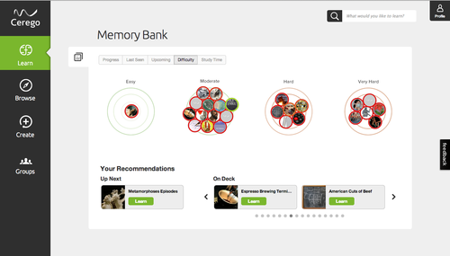
Maybe it’s our short attention spans, but we like visual things here at Cerego. We think beautiful, interesting animations are a good way to manage your memory, and that’s the whole idea behind the Memory Bank. You’ll see the Memory Bank all over the place - on your homepage, on your course details pages, and in the learning application itself. The goal is always the same: show you helpful information to show what you know, how well you know it, and how you need to review to keep that knowledge fresh. When we launched last year, we only had one view, showing overall progress. In the last few months, we’ve added a bunch of helpful new views (Last Seen, Upcoming, Difficulty, and Study Time), and we’ve redesigned the way the Memory Bank looks. Give them a look and play around - we think you’ll like seeing what’s inside your head!

Difficulty view - one of the newest visualizations in the Memory Bank
New Directory
There’s a lot of great material on Cerego already (and more being added every day). We wanted to make the process of finding this material much easier, so we’ve done a lot of work on the “Browse” section of the site.

Introducing “sets” and “series.”
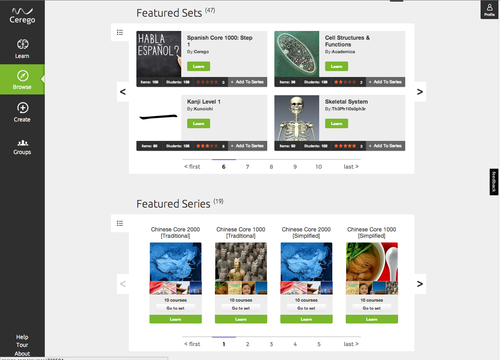
First, observant users will notice we pulled a bit of a fast one: we changed the way we describe collections of items. We used to describe the material as “courses” and “sets,” but the more we thought about it, the more we thought “courses” wasn’t a great term for something that might actually be a tool you use alongside other material in a course (like books, or other online resources). So instead, we now classify material as belonging to a “set” (a collection of items), or a “series” (a collection of sets).
We’ve added “Featured Sets” and “Featured Series” to the Browse page. This is the place to see great content picked by the Cerego team. To kick things off, we’re showing off some great series covering Spanish, Chinese Core, Physics, Geography and more! You’ll see more series - created by other users and us - soon.
Finally, you can now browse around the library using categories and subjects. This is a good way to explore what’s on the site if you don’t have something specific in mind. Happy browsing!
New Create Tools
Making sets is an excellent way to learn something you care about, and we’re all about making the process of adding content as easy as possible. This is an area where we got a lot of great feedback during our beta phase, and we’re happy we were able to add a bunch of things you were asking for!
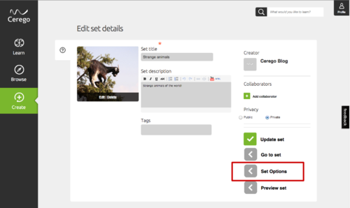
First off, you’ll notice a new field when you create your own set - “Set Options” on the right-hand side. This one’s vital - you can now categorize your sets so that other people can find them through the category browser. Choose the category that you think makes the most sense and add a specific subject to make it even easier to find. Don’t worry. You can always change this later! If you’ve already created a set, we didn’t categorize on your behalf - come on back and choose the category that you think fits best, and it will be easier to find in the browser right away.

Categorizing this set so that more people can learn about animals like this goat that climbs trees.
The other options you can change now are some of the quiz options learners will experience when they use your set. By default, a sets in the “language” category will include multiple choice and typing practice, and other sets will just use multiple choice. (We know that cues and responses can get a bit long, and typing everything out isn’t an ideal way to review). But you can change these settings if you want to fit your content better. As a general guideline:
- Multiple choice can ask you to identify the cues or responses. In most cases, it makes sense to select both directions. But if your items only make sense in one direction, just uncheck whichever direction quiz you don’t want to appear
- “Type in the answer”: this does exactly what it sounds like - it tests your ability to type out the cue or response. As a general rule, this is a good way to learn words or short, relevant phrases (such as “Thomas Jefferson). But a long description (such as, “The 3rd president of the United States of America”) is probably more typing than you want to do over and over again, so you would want to check only one direction (“Type the cue”).
The learning app will continue to evolve, so more choices will eventually pop up here. But this is a good way to customize your set to fit the material you want to learn - we’ll do the rest, making sure you (and anyone else) learns as efficiently as possible.
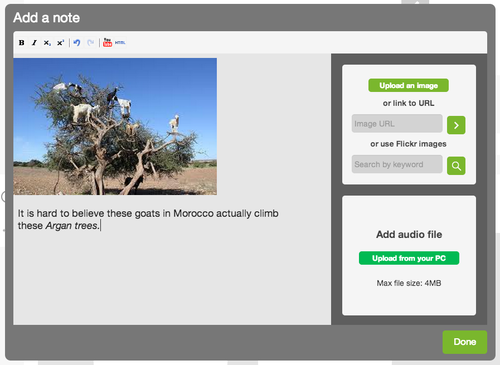
We’ve also upgraded the “Notes” section quite a lot. We love items with good notes - they provide more information or additional examples to make items rich and relevant. Now you can create & edit notes with a much bigger editing window, HTML support, and nice usability features (like drag-and-drop images from a browser into the notes field). If you haven’t explored Notes in your sets yet, you should!

Notes support drag-and-drop, multiple images, and richer markup & embed options
Finally, there are a thousand little things we’ve tweaked in response to your great feedback: adding superscript and subscript support, allowing more markup options, and changing default behaviors to be more natural (every time you click on an item, you enter “edit” mode automatically, for instance). We love feedback, so keep it coming!
And all the rest
In addition to all the feature building we’ve been doing, we’ve been updating the look & feel across the board. We’ve got a new logo, new colors, and new icons. We hope you like them - we think they're kind of sharp.
The changes that have gone live are just the tip of the iceberg - there’s more to come in the next few weeks, so stay tuned and keep on learning!


